Sennheiser has continued to evolve to constantly innovate and meet the demands of its customers time and time again for more than 70 years. This success and a philosophy of continual improvement are at the heart of the company’s mission to shape the future of audio. From its founding as “Labor W”, to building a dynamic global brand, the German audio brand has been reshaping the audio industry since day one. "This fine balance of forward motion, while still holding fast to values, is reflected in the consistent evolution of Sennheiser’s corporate design," the company states.
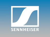
The most immediately recognizable changes will be in the evolution of the Sennheiser logo and wordmark, which will be further established as a stand-alone brand mark, making it even more recognizable. Describing the changes, Oliver Berger, Head of Global Design Management at Sennheiser, says: “The characteristic ‘S’ has been enhanced to make it more eye-catching and appealing. The outline around it is less immediately noticeable, giving the letter more space to shine. Both of these elements now flow into a unified whole, for a clearer, cleaner appearance. In the same way, we are refreshing our wordmark with a narrower font style that improves legibility. These careful yet crucial changes keep the logo faithful to the roots of the company while also making it look more elegant, modern and confident.”
 Sennheiser’s HE 1 will be the first product to feature the new logo – an appropriate way to introduce an icon redefined. Sold as "the best headphones in the world" and the successor to the legendary Orpheus, the HE 1 epitomizes the company’s innovative prowess, and is thus the perfect “brand ambassador” for introducing the new logo. Also, this means that the HE 1 already in the hands of their proud owners are now even more recognizable by featuring the "old" logo, which will state "I was one of the first" buyers!
"In the same way that the Sennheiser logo reflects both the innovative power and heritage of the company, the new visual language of the brand draws on a theme of complementary forces in balance. It presents a harmonious dialectic between “Magic” and “Logic” that powerfully appeals to both head and heart.
"Images that demonstrate the pride of Sennheiser’s technology-driven products will be placed alongside emotional images representing the joy of a superior listening experience. Because this reflects our ultimate goal: to create emotions through cutting-edge technology,” explains Oliver Berger.
The new logo and corporate design will also be used with immediate effect in business and sales communications, at events and in retail environments and points of purchase. To fully experience the world of Sennheiser, the Sennheiser Stores in Singapore and Germany offer a total immersion into the brand as well as an opportunity to explore its products.
www.sennheiser.com

